Power
Static Finance is building a unified transaction layer for energy where you can make settlements on power using blockchain technology. Such a huge idea, they needed an identity that matched.
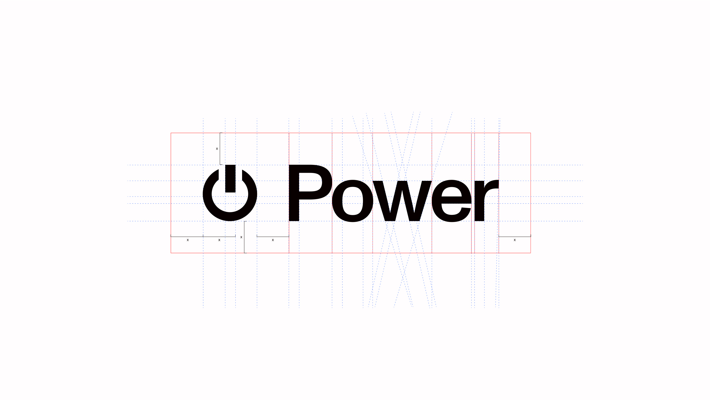
After a kickoff with the team and logo exploration for "Static Finance", I landed on the universally loved power icon. This symbol hadn't been used in crypto (or any brand) to my knowledge and it spoke to exactly what the company was selling - power. However, seeing the power icon next to the name Static, felt… wrong. The brand naturally wanted to be Power. "Buy Power" was thrown around jokingly but then ideas started bouncing off the team left and right. Could it be this simple?
The way this protocol runs, there’s a stablecoin, a staked coin, and a governance coin. We knew the government coin (or movement coin, as we’re calling it) was going to be $PWR and have the illustrious power icon as the token symbol.
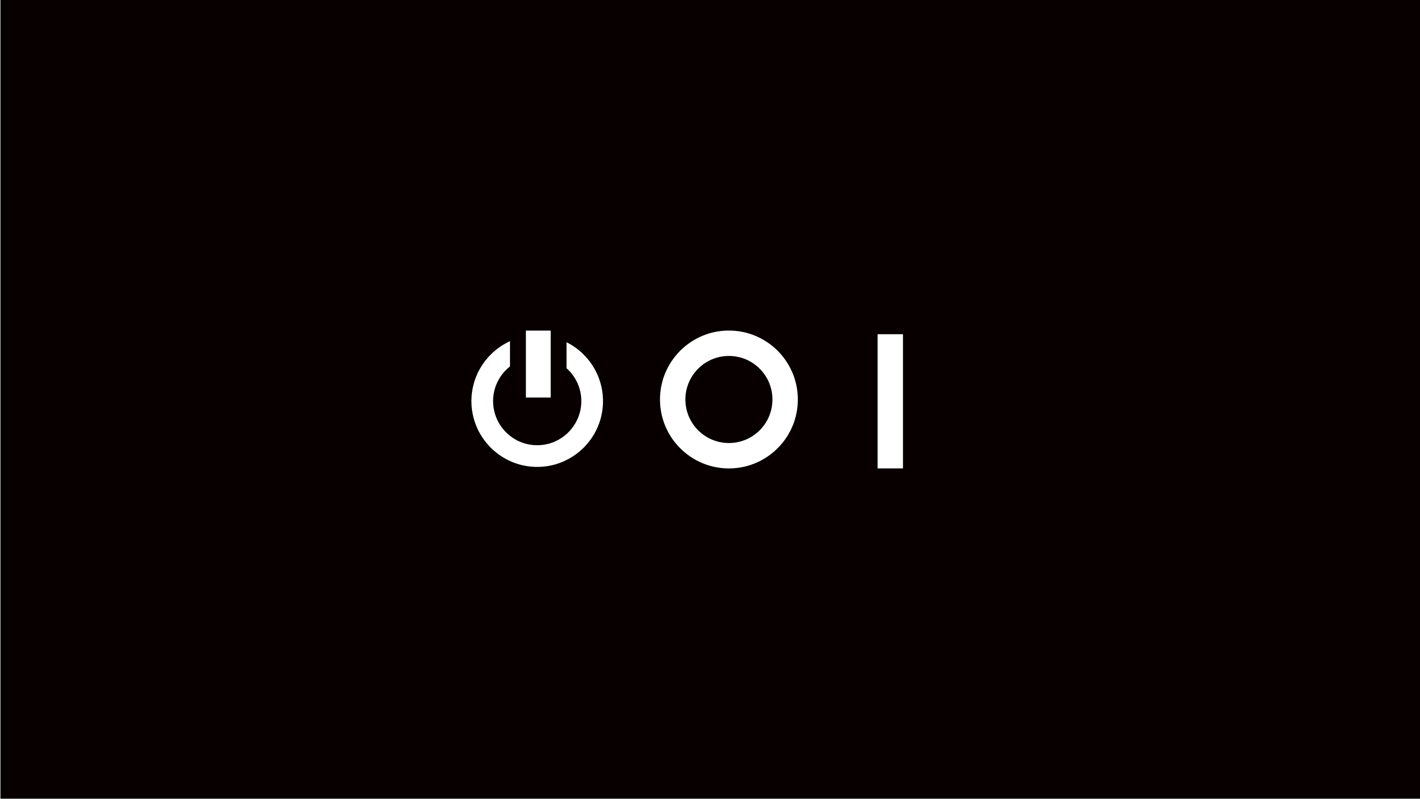
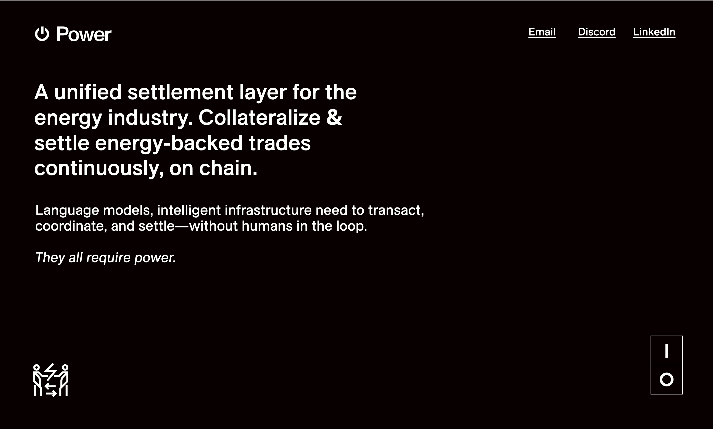
Taking a deeper dive into the power symbol, we remember the on and off switch found on power strips. Instead of using one symbol, they often use two, and these on/off symbols are universally known icons, too. The circle ‘O’ indicates off, and the line ‘|’ indicates on. It’s so simple you can type it out on a keyboard.
Using a metaphor to tie the tokens together, the open circuit as the stablecoin, the closed circuit as the staked coin - the story seems like it can’t be anything else.

